

A dashboard element is a graphical representation of one or several statistics collected during the experiment execution. You can set up a dashboard element by setting its properties in the chart's settings.
To open the chart's settings
- Click the
 cogwheel icon in the top-right corner of the desired element.
The chart's settings will open:
cogwheel icon in the top-right corner of the desired element.
The chart's settings will open:
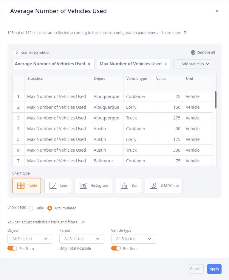
The dialog box with the chart's settings comprises the following areas:
-
The header with:
- Dashboard element's name — the name of the chart that you will see on the dashboard. The name is generated automatically based on the statistics added to this element. This name can be changed. Hover your mouse over the current name, click it to activate the editing mode, and define the new name.
-
 — click to close the dialog box.
-
The preview section:
- The list of added statistics
-
 Remove all — [available only if at least two statistics are added to the chart] clears the list of added statistics.
-
Add statistics — opens the drop-down list with the statistics to choose from when
creating or modifying a dashboard element.
The list comprises only the statistics that are enabled in the Statistics configuration dashboard.
- The preview area shows the added statistics in the selected visualization method and its settings.
- Chart type — statistics visualization method. You can choose between: Table, Line, Histogram, Bar, B-M-W line.
-
Show data — defined the type of data the added statistics will show:
-
Daily — statistics will show data per each day of simulation (e.g. the daily transportation cost).
If Daily data is visualized as a Table or a Bar chart, the statistics will show the data for one day only, i.e., either the current value of this day (e.g. in case of Available inventory statistics), or the value received at the end of the previous day.
-
Accumulated — [selected by default] statistics will show aggregated data gathered from the beginning of simulation (the
summarized transportation cost for a certain period of time).
Certain statistics show only Daily type of data.
-
Daily — statistics will show data per each day of simulation (e.g. the daily transportation cost).
-
Details and filters — set up the required data combinations to visualize (specific facilities, products, etc.).
The set of filters depends on the selected statistics.
By default all the available data is displayed.
-
Filters:
- Object — sites, suppliers, customers and custom facilities of the supply chain.
- Period — time periods of the current supply chain.
- Product — types products delivered within the current supply chain.
- Staff type — types of workers used within the current supply chain.
- Type — facility types (Customer, DC, Factory, Supplier, custom facility types).
- Vehicle type — vehicles defined within the current supply chain.
- Zone — certain areas defined within the current supply chain.
-
Details
- Per Item — enable the toggle button to visualize data per item.
- Only Total Possible — the data is shown in total only. This happens if at least one of the added statistics does not support visualization of data Per Item.
-
Filters:
- Footer with the Cancel and Apply buttons.
-
How can we improve this article?
-