

In the previous phase we imported the scenario, checked service level, and added events. In this phase we will run the Risk analysis experiment and analyze the received results.
Run the Risk analysis experiment
- In the experiments section click the Risk Analysis experiment tile to open the experiment controls.
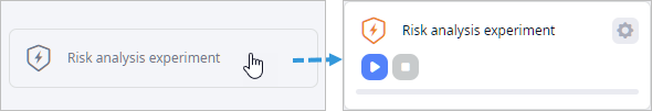
- In the expanded tile click the
 Show settings icon to open the experiment's
settings.
We are interested in the following parameters:
Show settings icon to open the experiment's
settings.
We are interested in the following parameters:
- Replications per iteration — replications are used to improve representability of the experiment run, since demand is set to a probability distribution. Note that completing the experiment with replications takes a bit more time.
- Target service level — the type of service level statistics, for which we will assess risks.
- Failure service level, % — the lowest acceptable service level. Once the service level drops below the specified value, it will become unacceptable. To become acceptable it must reach the specified Recovery service level.
- Recovery service level, % — the level at which the service level becomes acceptable again.
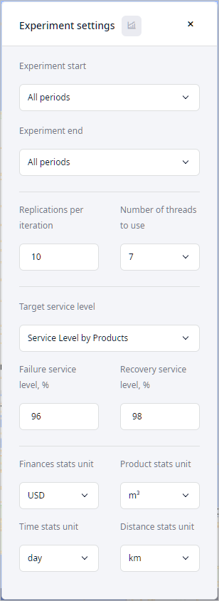
- Leave the default experiment settings and run the experiment by clicking
 Run. Experiment execution will take some time.
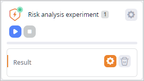
- Observe the final results.
When the experiment is completed, you will be taken to the Result page containing the results.
Let us analyze the received data.
Your data may differ, since simulation-based multi-run experiments have random seed value for each run.
Analyze the received results
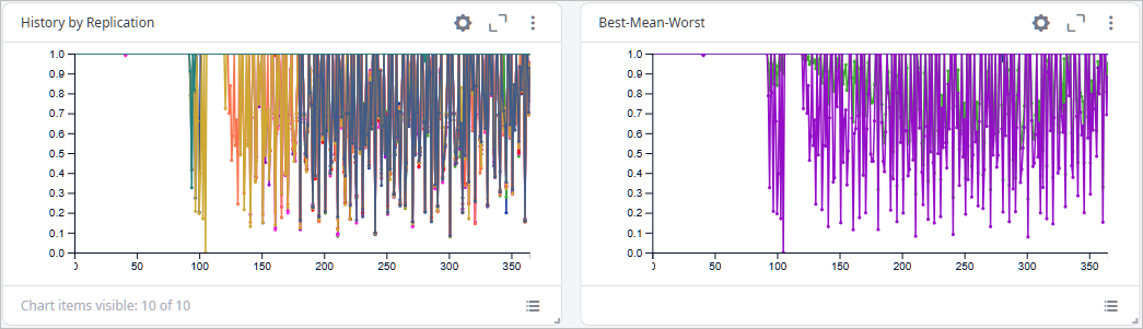
- Navigate to the Target Service Level page below the experiment view.
The page contains two charts:
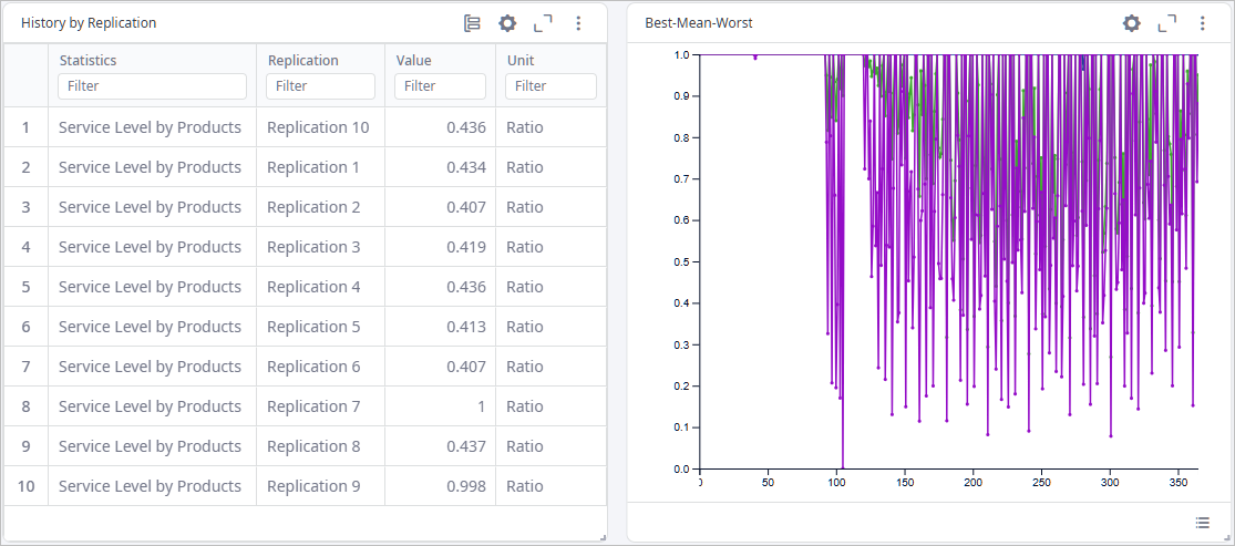
- History by replication — shows service level per replication.
- Best-Mean-Worst — shows best, mean, and worst service levels per day.
-
Click the
 cogwheel icon in the top-right corner of the
History by Replication element to open the chart's settings.
cogwheel icon in the top-right corner of the
History by Replication element to open the chart's settings.

-
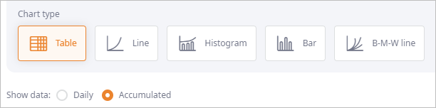
In the opened dialog box change the Chart type to Table,
then select the Accumulated radio button to observe the accumulated data instead of the daily data.
-
Click Apply to close the dialog box. The chart will now look like this:
-
Click the Value column title to sort replications by the ascending service level.
As you can see, the worst service level is at Replication 9.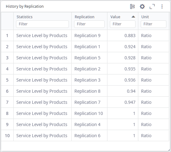
We have observed the basic output, for more information we must refer to the Events and Recovery page.
Observe Data in the Events and Recover Tab
- Navigate to the Events and Recovery page. The page contains three charts:
- Events Table — shows detailed statistics on the events that took place per replication.
- Recovery Time — the period of time (in days) during which the supply chain was running below the specified Failure Service Level.
- Total Time to Recover — the histogram shows statistics on the total amount of time the supply chain was running below the specified Failure service level.
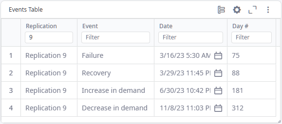
- Take a closer look at the Events Table chart:
- Replication — the ordinal number of replication, in which the event took place.
- Event — the name of the event that took place.
- Date — the exact date and time when the event took place.
- Day # — the ordinal number of the day when the event took place. The first day is the simulation launch day.
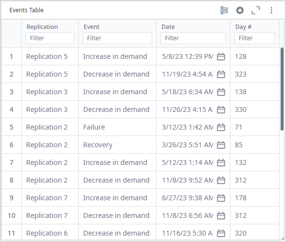
- Type 9 in the field below the Replication column name
to filter the data by this replication, which contains the worst service level, as seen on the
History by replication chart.
As you can see, the following events took place within this replication:
- Failure — the factory was closed on March 16th, which is the seventy‐fifth day of simulation.
- Recovery — the factory was opened on March 29th, which is the eighty‐eighth day of simulation.
- Increase in demand — customers started to place more orders on June 30th, which is the one hundred and eighty‐first day of simulation.
- Decrease in demand — customers started to place less orders on November 8th, which is the three hundred and twelfth day of simulation.
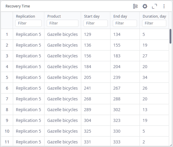
- Now take a look at the Recovery Time table:
- Replication — the ordinal number of replication, in which the drop of service level occurred.
- Product — the product for which the service level was dropped.
- Start day — the ordinal number of the day the service level dropped below the specified Failure service level. The first day is the simulation launch day.
- End day — the ordinal number of the day the service level reached the Recovery service level. The first day is the simulation launch day.
- Duration (days) — the length of the recovery period in days.
- Type 9 in the field below the Replication column name to filter the data by this replication.
As you can see, the service level dropped below the specified Failure service level 11 times. The last time occurred on 331st day, and the service level did not recover after that.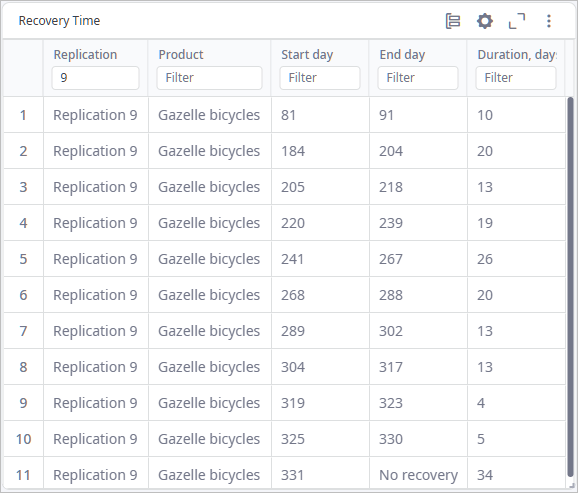
In the same way analyze the data on total cost, revenue, profit, etc., which is available in the corresponding pages below the currently open Events and Recovery.
Use the received information to improve the scenario input and avoid risks.
With the last step we have successfully completed the Risk analysis experiment tutorial.
-
How can we improve this article?
-