

A chart is the visualization method for a dashboard element that presents the statistics data in a graphical form. The following types of charts are available:
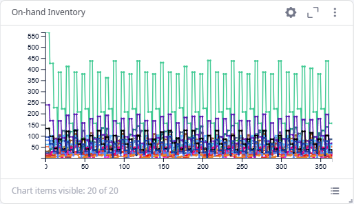
Line chart presents the statistics data as a series of data points plotted along the time axis. You can use a line chart to view how the statistics data was changing over time:
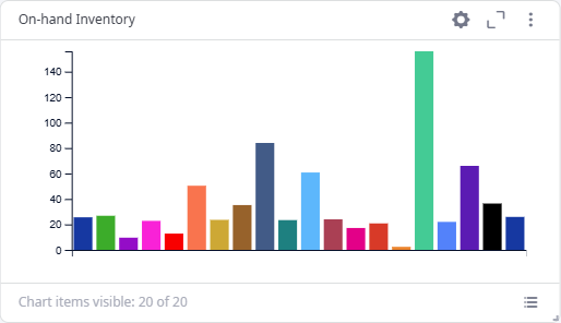
Bar chart presents the statistics data as single values as of the experiment current model date (as of the End date if the experiment is finished). You can use a bar chart to visually compare the statistics values:
Histogram chart presents the probability distribution of the statistics data:
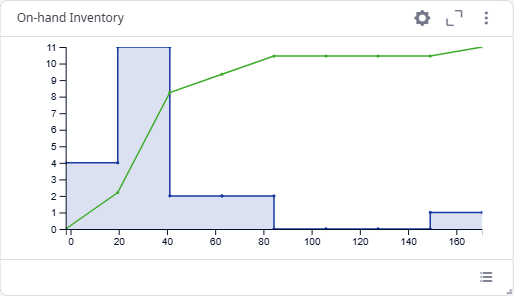
A histogram chart displays two sets of values for every statistics: statistics data values distribution and the statistics cumulative distribution function (CDF):
- Statistics data values distribution presents the frequency of occurrence of each specific values range. It is displayed as a series of rectangles plotted along the X-direction and the primary Y-direction on the left. The width of a rectangle corresponds to a certain values range. The height of a rectangle corresponds to the frequency of the values range occurrence.
- The statistics CDF presents the probability that the statistics will take a value less than or equal to a specific value. It is displayed as a line along the X-direction and the secondary Y-direction on the right. The X-direction values present the statistics data values. The Y-direction values present probabilities.
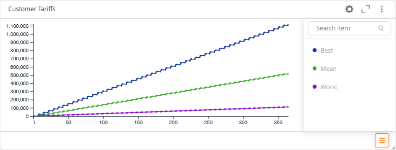
B-M-W line is a Line type of chart. It filters the required statistics data to present only the best, mean and worst values. When selecting more than one statistics to present, make sure that they have some meaning in common, otherwise, this chart will simply show the biggest, the smallest and the average values that have no relation to each other.
This chart's visualization rules rely on the statistics it displays. When displaying several statistics of:
- "The less the better" type, this logic will be applied to visualization rules.
- Different types, the default logic of "the bigger the better" will be applied to visualization rules.
-
How can we improve this article?
-